Saturday, March 31, 2012

Post #8 - Imposing

I was looking around the Internet and I came across this picture, which I found to be incredibly striking. 

Maybe its the angle that they took it at, or the sky in the background, but it the building is truly imposing, even though it is decaying.  I also appreciated the fact that it is centered in the shot, and that the clouds intersect the building at a diagonal angle.  The lighting is also interesting because the shadow at the top of the building makes it so that you cannot tell the exact angle of what remains of the roof. 


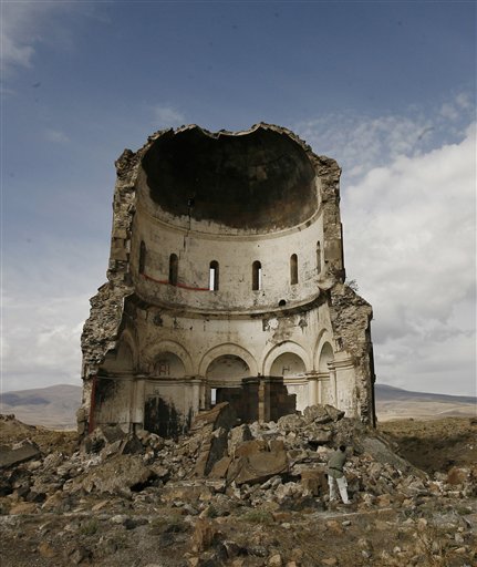
This picture instantly reminded me of a picture I took a little bit ago, still very recently.  I like the stormy sky in the background.  The lighting is the exact same as the above picture, which also gives it a pure effect.  The topic is also similar: monuments and statues.  Yet on monument is in its prime and the other is at the end of its time. 


Friday, March 30, 2012

Citrus walls

The first photograph is from the internet, and i found it after i took my own photograph (the second one of the two). I took my own photo a few days, and it is the back of Hobson, a house on campus that is directly next to mine. The color of the house, along with the dividing white line (that helps to create division and blocks in the photo) caught my eye. I like the way that the wall is so simple and bare, but the grate, the cracks in the wall, and the white line help to catch the eye. I included the grass in the photo for a good representation of color contrast, and to also add texture and more of a 3d appeal. The two photographs are simple in that the walls appear so simple, but their color and the other objects in the photo are the real contributors in  creating effective photographs.
internet photo from: http://www.shutterstock.com/pic-79653496/stock-photo-colorful-house-on-the-island-of-burano-with-a-bike-near-the-entrance.html
The first is a picture I took at the Perkiomen Creek. 
The second is Seneca Creek taken by a professional. 

Man's Best Friend-Post #8

I have recently been very interested in getting different POVs from various different sources, and this dog picture mixed in with that theme and that fact I was missing my own dog. I have always been interested at what kind of ideas go through other people, and animals for that matter, brains when they stare out windows, because I find it kind of odd but I am sure relaxing at the same time.  The scene in this picture is ambiguous to what is outside, as the external imagery is all white, but the dog is intently looking for something.
This is actually a photo of my dog, Rudy.  He was waiting one afternoon that I was home for my parents to return from grocery shopping.  Although I have come to understand the saying, "man's best friend" through the affection dogs can show someone, my dog truly seems to believe that my father and mother are his parents, and treats them as such.  The behind shot-POV was emulated from the picture above, and I played with the lighting so that the external activity Rudy is watching is also ambiguous.  I like the idea of having the thoughts and objects outside being unclear, because it allows individual viewers to create their own background story for the image.    


Thursday, March 29, 2012


The first picture I took for one of our projects and the second I found when searching on the internet.  I just like how the bush given a certain vantage point can express the same features as this tree in the Sahara.  The first pictures can be looked as a individual tree but in reality it is just a branch off of a bush.

Banisters: Color vs. B&W

The first picture is a photo I took of the banister in Bomberger.


The second photo I found to mimic mine is of a banister as well, named Banister by elenamay (deviantart.com).

Each of the photo is similar because of the subject matter. Both are of wooden banisters; however, they significantly different. First, my photo is in color, while the other is in black and white. I believe that my photo relies more on the rich color of the wood, while the second photo relies on repetition. The direct sun in my photo reveals the shape of each banister post with highlights and shadows. It also illuminates the textures of wood of the banisters as well. The black and white photo also uses the texture of the wood, but it does not rely on that nearly as much as my photo. However, the repetition in the black and white photo pulls the eye into the photo; where as mine stops short as the lines lead upward out of the photos. 

Tuesday, March 27, 2012

Follow the leader

I took this photo at a near by pond. The ducks came out for spring- but it ended up being a very chilly day.

I found this photo on the internet to match the one I took.

Monday, March 26, 2012

Post 6 - Pfahler


This is a picture of Pfahler which is a building here on campus. This has always been my favorite building simply because of the way it looked. One reason I really like looking at it from the front is the framing that the two trees do with the building. They are almost exactly the same distance apart from the middle of the building. I also really like how the bell tower sticks out visually from atop the building.


This picture was taken by Aiden O'Rourke and this is a building at Manila University of Santo Tomas. I think this picture captures a lot of the elements that the first photo does. First off, the walk way that leads up to the front of the building is very similar. It's straight down at gets narrower as you go on. Both buildings have a structure that extends out of the top which makes the building itself look very powerful. While the trees along the side are different and there are more of them, it still has the same general idea.

Sunday, March 25, 2012

tones and texture

Below is a photo I took: 


I found the following photo (from deviantart.com by Jusqu'au Bout) to match some of they elements of mine above:


Although they have somewhat different subject matter--a bench as opposed to a window--both photos are taken of the side of a building, giving the photos little depth. They are quite flat, keeping the eye from being drawn further into the photo. Also, both photos are taken from a straight-forward angle with the subjects in the direct center. 
The photos have similar color tones because the colors in the photos are rather muted, staying in the realm of grays, browns and blacks. Also, both houses in the photos have a rough-looking texture and those textures are highlighted by the composition of the photos. 


Friday, March 23, 2012

Juxtaposition


The first photo is one which i took; it is on the deck of a house on campus, and i was walking around taking photos when i stumbled across it.  It pictures a box of chalk and chalk drawings, directly next to a cigarette-butt holder. this is a hilarious juxtaposition that immediately caught my attention, because the chalk represents youth and innocence, and cigarettes represent people of an older age (maturity, grownups, experimenting, etc.).  The photo beneath it is from Zoe Strauss's exhibit, and it features a child with a gun. Like my photo, it is a juxtaposition of both childhood and innocence mixed with something that represents adulthood and violence.
http://www.jkbblg.com/2009_12_01_archive.html

Thursday, March 22, 2012

By Ben Mosher at Breckenridge
I picked this picture because I think it shows the strong difference between how a cliff that I snowboarded down can look so different from a cliff that is not able to snowboarded or skied down.  I also think that there is a lot of strong color contrasts in both picture.  I also really think there is some true natural beauty in both sides. 

Field of Dreams


Baseball. America's greatest pastime, and associated with the warm weather of summer, a time of relaxation, and when lifestyles are made easier by vacations and time off from school and work. I have been a fan of baseball, a sport rich in history, for years. So naturally, it was a great delight for me when I had the opportunity to be on the field at Citizens Bank Park earlier this week. I have an internship with CBS 3 in Philadelphia, and it just so happened that we needed shots of the ballpark for the evening news, and I was able to go with the photographer to get on the field and take pictures. The experience was incredible, being able to go where only the greats normally go.


Baseball fields are a beautiful piece of a natural landscape in their own right. Well-kept by a grounds crew, it brings back memories of youth league games, and being able to play organized games with kids who love the game as much as you do. I found this particular picture on www.webstock.pro, and it caught my eye immediately. Titled "Chalk Line on Baseball Field", I love how the chalk line is lined up perfectly with the foul line on the wall in the outfield. It breaks the photo up nicely, as the dirt and grass are divided. Most of the attention goes to the upper left corner where the third base bag is, but there are many different lines in this picture that I really like.

Post 7- White


I took the above photograph outside as the sun was setting.  I loved the blooming trees and especially the white blossoms.  After looking at the photograph on my computer, I realized that the trees looked almost like they were covered with snow.  The fact that the lighting was from behind made it so that the actual blossoms are not clear.  I liked the backlighting because it makes the sunset more of the focus of the photograph.  I was able to find a similar photograph online in the subject matter, but the difference is that the trees in this photograph are actually covered in snow.  I was amused by how similar the photographs actually were.  Even the shades in the sky are incredibly similar.


Front Windows #7

I found this picture kinda messing around on the Internet, looking for different kinds of viewpoints.  Although the picture is not extraordinary in any real way, I liked the way the the frame and POV have a different feel to them because the picture is taken inside of the window frame, including a view within a view.
This is a photo I took while I was home for spring break that I did not use during my document presentation.  Although I chose a different angle from which to take the picture from compared to the 1st photo, I thought it incorporated the same elements that the picture above held.  Even though there is not as much as a frame aspect within my photo, the idea of a abnormal POV from which to take a picture from still remains, and the scenery-objects being focused on are very similar.    


Monday, March 19, 2012

Post #5 NZ

I found this photo called Majestic on deviantart.com by MaximeCountry. It seems surreal as the sky is so blue and the entire landscape is absolutely fascinating. I chose this because I went to New Zealand over spring break to visit my brother and took pictures while I was there. The landscapes over there are like nothing I've ever seen here in the States so this picture seemed appropriate.


This is a picture I took from New Zealand. The scenery is really incredible and I think this picture in particular is similar to the first picture. The sky takes up a large portion of the picture and there's a mountain in the background. Unfortunately I think the color in the first picture is better but I still like the one I took too.


Sunday, March 18, 2012

Night Light

This first photo is my own. The photo below was taken from DeviantArt.com, and is titled "l.a.m.p." by whoisjonmadd. 

When I was browsing deviantart.com, I realized that "l.a.m.p." was similar to my photo because of the composition, in the sense that the lamppost seems to mirror the street sign in my photo. Each is in the foreground and acts as a means to divide the photos. Through this division, both photos emphasize the left half of the photo. The eye looks past the sign to see the trailer in my photo and it looks past the lamp to see the street and house in whoisjonmadd's photo. However, whoisjonmadd's photo seems to focus on the lamp as a central part of the photo, whereas the sign in my photo is meant to be looked passed. Also, the coloring is very different as the light in my photo comes primarily from the street lamp and creates a warm tone, whereas, "l.a.m.p." seems to have other sources of light and creates a cool tone. 

Yet, the photo below, called "Under The Street Light At Palm" by marc-ryder (devientart.com), seems to better match my photo in color tone and lighting. The primary lighting sources are the lamps on the left of each photo. Also, because both were taken at dusk, "Under The Street Light At Palm" mirrors the slight illumination of the sky found in my photo. Also, it is clear that marc-ryder's photo has been digitally enhanced, so I decided to see what mine would look like if I enhanced the color on my photo with Picasa. Clearly, the photos look ever more similar, as they seem to be divided in half by warm orange colors on the bottom half of the photo and deep blues on the top half. 


*Both photos were found to match the photo I took; however, the color enhancement came after finding these similar photos. 


Saturday, March 17, 2012

Night and Day-Post #6

Thought that this picture of an abandoned building's hallway were pretty creepy as well as cool looking, especially with the way the light comes in from the door openings on the left.  Although I think that the sheer setting of this picture is responsible for why I was drawn to it, the lighting captured certainly was an aspect I envied and enjoyed.
Now although certainly not as eerie as the the previous photo shown, this hallway is from the side doorway in my house.  The lighting, although at first appearing to originate from the left of the hallway, is coming from the waning light as the sun set from the right side windows of the hallway.  I know that the picture being taken here is at an earlier time, or at least appearing as such, compared to the first photo, it mimicked the lighting aspect I had liked so much in the abandoned hallway.   


Friday, March 16, 2012

nostalgia


The first photo is one which i took in a neighborhood around Ursinus while i was on a walk, and the 2nd photo is one which i found on a photographer's website. I took the first photo because i liked the way that it shows life in the suburbs, where people hang their laundry. it reminded me of my own home, where, since i was born, my mother has been hanging laundry. So, seeing this hanging laundry brings back not just memories of seeing laundry-but also memories of home in general. The photo beneath it is similar in that it represents the lifestyle in this city, where people hang laundry from building to building.

Maybe it's a sign.


The first photo is one that i took on my own travels and walks around Collegeville. When i was walking down the street which it was one, my eye was immediately caught by the way which the sun was so strongly lighting up the two signs and giving them such an angelic, almost surreal look. my favorite part about this photo is the signs--their positioning, color, rusty aspect. I like photography with signs in it---for some reason which i am not even fully sure of! So, i chose another photograph with a sign in, which is actually vintage (or appears so).

Post #6- Stems

After the presentations yesterday, I decided that I would draw my inspiration from Lee Friedlander's work, "Stems."  I was particularly interested in this photograph. I liked the fact that the water in the vase blurred out the background so that the stems were the only focus. 
Lee Friedlander, Stems, 1999


I decided to use a similar subject matter.  I photographed the reflection of my room in a mirror through the stems of a bouquet of flowers.  But instead of focusing on the stems, I focused on the room.  The stems served more as framing for my photograph.  Friedlander and I chose the same subject matter for the most part, but approached it in a slightly different way, creating entirely different meaning to similar photographs. 

Thursday, March 15, 2012

backlight

 I took this picture inspired by the one I found online. I took it at night, so instead of the light source being over baring and white the light is coming from the store.

 I found this image online first for inspiration 

Supplies

I took this picture in South Jersey on my way home for spring break.

 I found this picture on the internet after taking mine. 


The first picture was taken in Pike's Peak Colorado.  The second picture was taken at Marsh Creek State park.  I Like how both have the the puffy clouds almost seems as if you were to fall into one you wouldn't actually fall right though.

The first picture I took in valley forge park of just a silhouette of trees.  The second picture with a subject in the foreground made a more appealing picture.  Both great examples of back lighting